Radio Buttons in React 16
How do you use radio buttons in React 16?
I agree, it can be confusing at first. Let me explain it to you with a help of a simple example.
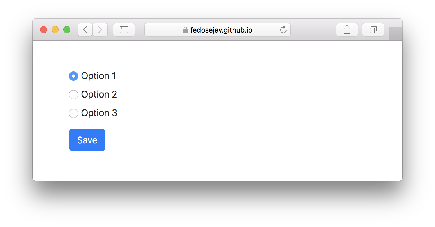
Here is the application that we're going to build:
You can find the full source code in this GitHub repository.
We'll start by creating new React component called App:
import React, { Component } from "react";

class App extends Component {
  render() {
    return ({/* JSX code */});
  }
}

export default App;
Our component doesn't render anything, yet.
What should it render? From Figure 1 you can clearly see the following 2 user interface elements:
- Radio buttons
- Save button
Let's start with creating radio button elements. In render() function we'll write JSX code that creates <form> element with 3 <input> elements nested inside:
<div className="container">
  <div className="row mt-5">
    <div className="col-sm-12">

      <form>

        <div className="form-check">
          <label>
            <input
              type="radio"
              name="react-tips"
              value="option1"
              checked={true}
              className="form-check-input"
            />
            Option 1
          </label>
        </div>

        <div className="form-check">
          <label>
            <input
              type="radio"
              name="react-tips"
              value="option2"
              className="form-check-input"
            />
            Option 2
          </label>
        </div>

        <div className="form-check">
          <label>
            <input
              type="radio"
              name="react-tips"
              value="option3"
              className="form-check-input"
            />
            Option 3
          </label>
        </div>

        <div className="form-group">
          <button className="btn btn-primary mt-2" type="submit">
            Save
          </button>
        </div>

      </form>

    </div>
  </div>
</div>
Whoa, that's alot of <div> elements! Do we really need them?
Not really. Their purpose is to create a layout using Bootstrap grid system. If you're not familiar with Bootstrap - don't worry, just focus on <form> element:
{/* ... */}

<form>

  <div className="form-check">
    <label>
      <input
        type="radio"
        name="react-tips"
        value="option1"
        checked={true}
        className="form-check-input"
      />
      Option 1
    </label>
  </div>

  <div className="form-check">
    <label>
      <input
        type="radio"
        name="react-tips"
        value="option2"
        className="form-check-input"
      />
      Option 2
    </label>
  </div>

  <div className="form-check">
    <label>
      <input
        type="radio"
        name="react-tips"
        value="option3"
        className="form-check-input"
      />
      Option 3
    </label>
  </div>

  <div className="form-group">
    <button className="btn btn-primary mt-2" type="submit">
      Save
    </button>
  </div>

</form>

{/* ... */}
Now let's take a closer look at the first input element:
<input
  type="radio"
  name="react-tips"
  value="option1"
  checked={true}
  className="form-check-input"
/>
Apart from checked={true} and className="form-check-input" props it looks exactly as your usual HTML <input> element. However it only looks like one (on purpose I guess). But it works differently, because in this case <input> is a React component, not an HTML element!
Just like with any other React component type, value, checked and className are component properties. However, user interactions with radio buttons affect checked's value: user can select it and unselect it by selecting another radio button.
If you pass checked={true} then React will render:

If you pass checked={false} then React will render:

We know that if React component can render different things, then it has to maintain state that tells it which thing to render. It's clear that our <input> component has 2 states to render: selected radio button and unselected radio button.
Let's make our App component stateful:
import React, { Component } from "react";

class App extends Component {
  constructor(props) {
    super(props);
    this.state = {
      selectedOption: "option1"
    };
  }

  render() {
    return ({/* JSX code */});
  }
}

export default App;
In our state object we have selectedOption property with the initial value of option1. This tells our App component which radio button should be selected. Naturally all other radio buttons should be unselected.
In our application we have 3 radio buttons where each of them has 2 states: selected and unselected. By explicitly specifying which radio button is selected, we're also implicitly specifying which should be unselected. When you create radio buttons using HTML, the same result is achieved by grouping radio buttons together using name HTML attribute.
Now we need to pass true or false value to checked property for all 3 <input> components. Only this time the value for checked is calculated by comparing component's state with input's name:
{/* ... */}

<form>

  <div className="form-check">
    <label>
      <input
        type="radio"
        name="react-tips"
        value="option1"
        checked={this.state.selectedOption === "option1"}
        className="form-check-input"
      />
      Option 1
    </label>
  </div>

  <div className="form-check">
    <label>
      <input
        type="radio"
        name="react-tips"
        value="option2"
        checked={this.state.selectedOption === "option2"}
        className="form-check-input"
      />
      Option 2
    </label>
  </div>

  <div className="form-check">
    <label>
      <input
        type="radio"
        name="react-tips"
        value="option3"
        checked={this.state.selectedOption === "option3"}
        className="form-check-input"
      />
      Option 3
    </label>
  </div>

  <div className="form-group">
    <button className="btn btn-primary mt-2" type="submit">
      Save
    </button>
  </div>

</form>

{/* ... */}
Expressions this.state.selectedOption === 'option1', this.state.selectedOption === 'option2' and this.state.selectedOption === 'option3' will be evaluated into true or false based on what is component's state and they will tell React how to render our <input> elements: selected or unselected.
Notice that we're in control of which <input> component should be rendered selected and which - unselected. And by providing value property we're taking all of the control over our <input> components and turning them into controlled components.
A Controlled component does not maintain its own internal state; the component renders purely based on props.
However, notice that at the moment, we're rending 3 radio buttons where the first one is selected. If I click on any other 2 - nothing happens. They're not selected. Or to be more specific: they're not rendered any differently.
And that should make sense to you, because when user intracts with our radio buttons we don't update our component's state and hence - don't render them differently. As a result, from the user's point of view: our radio buttons "don't work".
How do we make sure that our component's state changes when use clicks on our radio buttons?
React offers onChange property that we can pass to our <input> components to handle changes:
{/* ... */}

<form>

  <div className="form-check">
    <label>
      <input
        type="radio"
        name="react-tips"
        value="option1"
        checked={this.state.selectedOption === "option1"}
        onChange={this.handleOptionChange}
        className="form-check-input"
      />
      Option 1
    </label>
  </div>

  <div className="form-check">
    <label>
      <input
        type="radio"
        name="react-tips"
        value="option2"
        checked={this.state.selectedOption === "option2"}
        onChange={this.handleOptionChange}
        className="form-check-input"
      />
      Option 2
    </label>
  </div>

  <div className="form-check">
    <label>
      <input
        type="radio"
        name="react-tips"
        value="option3"
        checked={this.state.selectedOption === "option3"}
        onChange={this.handleOptionChange}
        className="form-check-input"
      />
      Option 3
    </label>
  </div>

  <div className="form-group">
    <button className="btn btn-primary mt-2" type="submit">
      Save
    </button>
  </div>

</form>

{/* ... */}
Now whenever user clicks on our radio buttons, React will call handleOptionChange function.
Let's create that function in our App component class:
handleOptionChange = changeEvent => {
  this.setState({
    selectedOption: changeEvent.target.value
  });
};
handleOptionChange will get changeEvent object that we can use to reference the value of <input> element that user clicked on: changeEvent.target.value. We're assigning that value to selectedOption property of our state object and calling setState() function to update component's state.
Now React will render our radio buttons differently. Now they're "working" from the user's point of view.
And it's all it takes to implement radio buttons in React.
Our <input> components are controlled by us. Or more specifically - by our component's state and user's ability to change that state by interacting with rendered radio buttons.
On the other hand we could have made our <input> component uncontrolled - all we need to do is to remove value and checked properties from <input> components.
An uncontrolled component maintains its own internal state.
According to React documentation: uncontroled components maintain their own state - that's why they're called "uncontrolled", because we, developers, don't have the control. It's incapsulated inside of the component itself.
However, if we give up the control, we need to pass name property to our <input> components in order to group them together (like with HTML <input type="radio"> elements) so that when user selects one radio button - the other ones are then unselected.
Wouldn't it be easier? After all our component would be stateless and we would write less code!
True, but consider this: how would you tell React which radio button should be selected intially? You don't have control, so it wouldn't be straightforward.
Now let's add onSubmit property to our <form> component:
<form onSubmit={this.handleFormSubmit}>
{/* ... */}
</form>
When user submits our form we want React to call handleFormSubmit function. Let's create it in our App component class:
handleFormSubmit = formSubmitEvent => {
  formSubmitEvent.preventDefault();

  console.log("You have submitted:", this.state.selectedOption);
};
It gets formSubmitEvent object as a parameter. We then preventDefault() on it, to prevent the default form submit behaviour.
Finally we log selected option's name in a web browser's console. We get selected option's name from our component's state: this.state.selectedOption.
And that's the convinience and the power of being in control of your inputs with React!
Thank you for your attention!
Please take a look at the complete source code on GitHub and the live version of our app.
I hope you've enjoyed this tutorial and I would love to hear your feedback in the comments. You can get in touch with me via Twitter and email.